Quantitative Analysis
Quantitative analysis helps turn numbers into meaningful answers. It includes the statistical methods used to measure patterns, compare groups, test relationships, and support sound conclusions. While terms like p values, significant differences, descriptive statistics, and statistical inference can feel intimidating, they are tools. A hammer and nail are tools for hanging a picture on the wall. Statistics are tools for understanding the results of the data and how confident we can be in them. Let’s not love or hate tools. Let’s just use them to get the project done.
A strong quantitative approach does more than run calculations. It helps organize research questions, identify the right statistical methods, and present findings in a way that is clear and useful. Whether the goal is to summarize data, compare outcomes, or interpret trends, quantitative analysis provides a structured way to move from raw numbers to reliable insight.
Statistics can also become much easier to understand when they are explained through memorable examples and visual thinking. For instance, a graph can feel less abstract when its structure is tied to a simple mental image. These kinds of teaching tools help make technical concepts more accessible and less overwhelming, especially for students, researchers, and professionals who want practical understanding rather than unnecessary complexity.
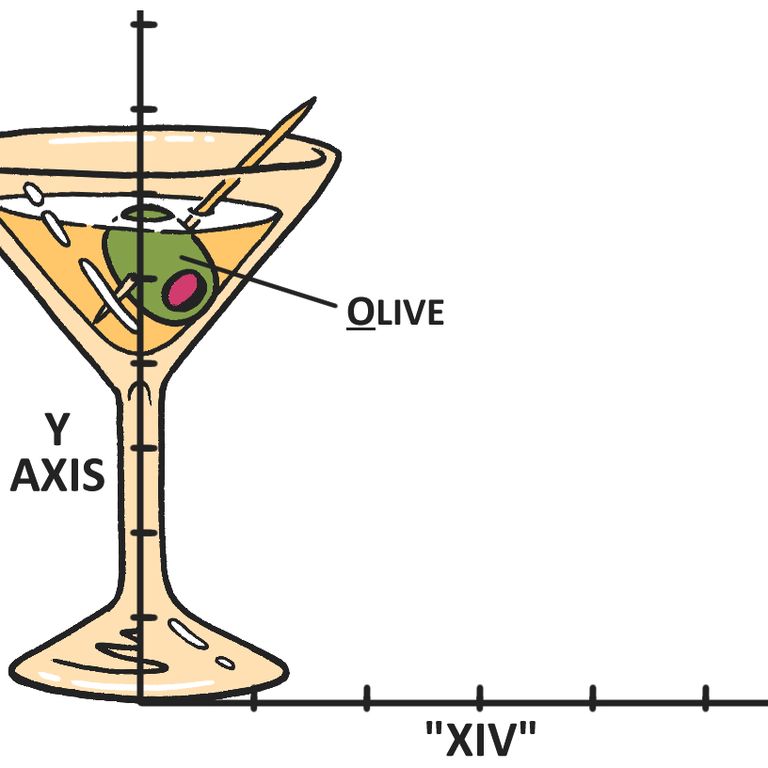
The martini glass symbolizes a graph. The martini glass itself stands for the “Y” axis, always on the left. Its olive stands for “O” as in ordinate (another name for the Y axis that is easy to forget). In the term “XIV,” the X stands for the X axis, always on the bottom, and combined with IV looks like a Roman numeral that helps you remember that the independent variable (IV) goes on the X axis.
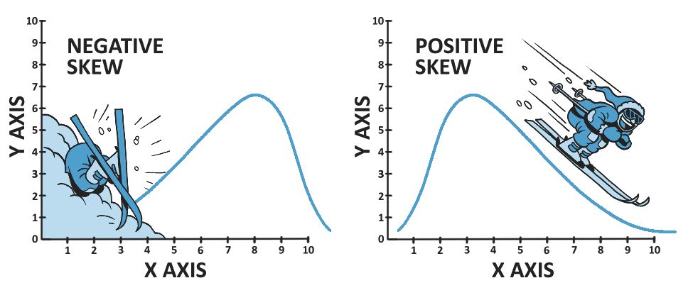
The skiers symbolize skew. Graphed data form patterns. One pattern is a skew towards high or low numbers. Data rich in low numbers have a “positive skew,” easier to remember when thinking about a positive experience skiing down a snow-sparkled mountainside. Data rich in high numbers have a “negative skew,” easier to remember when thinking about slamming into the Y axis!